Dec 27, 2010

Drawing Basics: Anatomy of the neck, part three

As we slowly move our way through the anatomy of the human form for the artist, we move to a new group of neck muscles in this post. We move away from the vertebral and scalene muscles and on to a new batch of muscles located at the front of the neck.

Today, we will look at the muscles that attach to the hyoid bone and control swallowing. Like the other anatomy posts we will review the origin, insertion, and action of each muscle. 

Let's take a look.

Dec 18, 2010

Watercolor Basics: How to paint a glass, transparent objects

A watercolor painting of transparent glass.

Painting transparent objects can be tricky. The question is how can we illustrate the form of the object while still allowing the object to appear see-through or transparent. With painting transparent objects, there are some basic tips that can help us achieve this goal more easily. They are:

 1. Using a basic nine value scale, with 0 being the lightest and 9 being the darkest, use 0-1 for highlights and 8-9 for the darkness of the ridge and thick areas of the glass. 

2. Don’t forget that glass has thickness. Make sure that when you draw the shapes of the object, draw out the thickness of the glass as well. 

3. Glass has shadows. Even the transparent objects have shadows. This can be easily forgotten by beginners. 


This demonstration is going to focus on painting a clear glass in watercolor to demonstrate how to paint transparent form. Today, we will paint a glass object with complex shapes in a step-by-step process.

Dec 17, 2010

Quick Tip: How to Draw Books

I often get asked what books I would recommend for learning or improving drawing or painting technique. For me, this is a difficult question to answer because I find peoples' interests and tastes so vast and varied there is no one recommendation I could make to fit all the interests, concerns, and needs that pertain to drawing and painting technique. I do not want people to rush out and buy an art book based on my opinion and find out its not what they are looking for. 

To give an example, when I teach landscape painting I will lend my books to my students. Each person will inevitably prefer a different book. They may prefer one over another because of the style of painting, the techniques taught, or the subject being used in that book. Because of this, I have found it best to not recommend a generic list of landscape painting books and try to apply it to everyone. 

I do have my favorite books and I am happy to share that as I like to talk about all things art, but I find myself making a different recommendation to my students. I thought I would share that with you today.

Dec 15, 2010

Drawing Basics: Foreshortening Form

Foreshortened arm
A good example to describe foreshortened form is when a person points their finger directly at you. From your vantage point, his arm is not seen lengthwise, as it would be if it were resting by his side. Instead, the arm is visually compressed between the hand and the body. The distance between the two appears smaller and the arm takes up less visual space as the position relates to your view. This is because bulk of the surface planes of the arm are now running perpendicular to your viewpoint.

Foreshortening is a critical part of drawing three dimensional form. Today we are going to define foreshortening and examine how it works. Let's start with a simple box.


Dec 12, 2010

Drawing Basics: Anatomy of the neck, part two

Muscles of the neck, posterior view

In  part one of the anatomy of the neck we looked at a few of the muscles that shape the neck. Here is another view of those same muscles.

In part one, we saw the muscles as viewed from the side. In part two, I will illustrate those same muscles viewed from the back, or the posterior view. Along with the new diagrams I will list the origin, insertion, and action of each muscle as I did in part one.

We will cover the muscles in the same order we did last time.

Dec 8, 2010

Drawing Basics: Anatomy of the neck, part one

Anatomy of the neck
Moving down from the skull and the muscles of the face, the neck seems like a good area to cover for a human anatomy for artists topic.

You may be surprised at how many muscles are in the neck, but this makes sense. The neck can move in complex ways and that requires many structures working together.

Today, we will look at the skeletal structures and some of the major muscles of the neck.  As with the post on the muscles of the face we will review the origin, insertion, and action of each muscle.   

Lets start with the skeleton.

Dec 5, 2010

Color Basics: Tints and Shades

Saturated color straight from the tube is great. Color adds to  the expressiveness of a painting or it attracts attention to a work as the saturated color pops into someones view easily. 

Though this does not always tell the full story we wish to communicate. Sometimes painting with saturated colors straight from the tube can cause the colors to compete with each other, creating confusion within a scene.

When painting realistically, we will need to change the value level or the lightness and darkness of the color to relate the local area of the image to the scene as well. 

Shades and tints are one way to adjust the lightness and darkness of of a color. Today, we are going to look at these. We will look at what shades and tints are, how they work, and we will look at some reasons why we might want to use them.

What Are Shades and Tints

Shade is the term used to describe a color that has been mixed with black to darken the color. This can be useful when painting an area in shadow. For example, if painting a blue couch that has a single light source coming from one side, parts of the couch will be in shadow. To change the value level of those areas of the couch in shadow we can add black to the blue to lower the level of perceived light in that area and darken the couch.

Tint is the term used to describe a color that has been mixed with white to lighten the color. Tints are useful when working in the light areas of a subject. Using the blue couch again, some of the light areas of the couch will receive more light than others. This will cause the value levels to change within the light area. Mixing white with the blue used for the couch is one way to lighten those areas to look like more light is reaching those spots. 

Both shades and tints can be used to reduce the saturation or intensity of color without any consideration for the effects of light as well. An example of this might be when painting for a Christmas card illustration we may decide we want a deep dark red in the illustration rather than a bright red. We can add black to our primary red to get the desired shade.  

(To see a discussion on the levels of lights and dark go to the value scale post.)

Let's look at tints first.

Dec 1, 2010

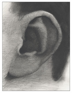
Drawing Basics: Structure and Anatomy of the Ear

Charcoal drawing of an ear


The ear is one of those areas that seems simple enough to draw, but on closer examination, it turns out to be a fairly complex form.

Like other features, ears are different for everyone. They may be shaped differently, some short and curled, others long and flat. They may stick out or lay pressed against the head. Earlobes even vary in shape. The right ear can vary from the left ear on an individual as well.

Yet, even with the great variety in ear shape and size, there are some characteristics of the ear that are similar from person to person. These characteristics are what we can identify as key components of an ear. We use these components to work out the shapes and structures within the ear.

Today, we will look at the anatomy of the ear to see the basic shapes, structures, and forms the ear creates.


Nov 28, 2010

Color Basics: Color and Value

Looking back at the post about the value scale, we can see that value is the level of darkness or lightness of a surface. In a grayscale, the lighter the surface the closer it comes to the value level of white. The other side of that is the darker the surface the closer it comes to the value level of black. Color has value properties as well.  A color can be lighter or darker than other colors. 

Another way to look at this is to see the value of a color separate from the other properties of the color. We can remove the hue of a color to reveal the color's value. In this post we will do just that. We will look at a color sample and then remove the hue characteristics to see how the colors compare in value.

Nov 24, 2010

Drawing Basics: The curve of the spine and gesture of the torso

Drawing the human figure has its challenges, which is why I like the subject. Since we are accustomed to seeing the human form and wired to understand and interpret its movement and actions, there are many elements that can go into drawing the human figure. There is plenty that can go wrong as well. Not only do we need to evaluate the proportions and shapes the figure creates, we also need to look at the placement and location of the forms within the body. This will help give the figure we draw a sense of weight. 

One area that has a dramatic impact on the feeling that there is weight to a figure is the how we draw the large shapes of the head and torso. Drawing the forms to line up in a straight line will cause the figure to look stiff or stretched out. This is because the spine curves. This curve directs the direction the forms move and their location as they relate to each other.


Lets take a look at how the head, ribcage, and pelvis positions relate to each other to see the curve of the torso as its surface moves vertically.

Nov 20, 2010

Watercolor Basics: Yosemite Landscape Demo

Watercolor Demo: Landscape of Yosemite
Watercolor painting of Yosemite
Yosemite Landscape in Watercolor


In this demonstration, I am going to show you some of the principles of watercolor and landscape painting. First, in watercolor, always start with lighter colors on your painting, because of the nature of watercolor, you can easily cover a light color with a darker color to create more depth. Second, in landscape painting, having atmospheric perspective, we generally will have lighter backgrounds and darker foregrounds. 

Based on these two principles, we are going to start with background mountains first and then the foreground trees.

Nov 16, 2010

Drawing Basics: Drawing an ellipse.

The ellipse is a shape that commonly appears in the shapes and forms of everyday objects. If we want to draw those objects in a way that mimics what we see in life, we will need to understand the ellipse as a shape and how it functions.

Today, we are going to look at how to draw an ellipse and how the ellipse behaves in three dimensional space.

Like drawing a circle or other uniform shapes, drawing a uniform ellipse can be done with a little practice.  Let's start by the looking at how ellipses are formed visually.


Nov 7, 2010

Drawing Basics: Muscles of the face

Last Sunday I posted a blog post about the human skull and I figured, that today, I would continue and build on that last post. 

Today, we will look at the muscles of the face. We will look at the general placement of each muscle and review the action for that muscle.

Each muscle has origin and an insertion points. These are the anatomical terms for the different places muscles are attached.

Some General Anatomy Terms
  
The origin of a muscle is the point or points where the muscle attaches to a fixed location or locations, this is the part of the body is unaffected be the muscle moving. The insertion is the reverse of this attachment, the muscle is attached to the part of the body that is moved by the muscle. For example, the bicep of the arm is attached to bones on the torso, this is origin, and spans across the humerus to the bones forearm, this is the insertion as the arm moves when the muscle contracts.

The action of a muscle is the movement that occurs when the muscles contract.  For example, the bicep of the arm pulls the forearm up bending at elbow.


Nov 5, 2010

Watercolor Basics: How to Use Masking Fluid

Article and painting by Hsuan-Chi Chen

Today, we are going to look at how to use masking fluid in watercolor while working on the bulb of garlic that we did in last week's watercolor basics post. One of the things we can do with the masking fluid is create really neat and clean highlights. This is because masking fluid can cover any shape and size of area on the painting, even for really tiny areas. It is a really versatile tool when it comes to watercolor painting.

Let's look at how to use masking fluid in a step by step demonstration of this painting.


Nov 3, 2010

Painting Basics: Value Pattern Studies, choices in composition

Painting realistically is not just about painting what you see. As we paint, there are choices to make along the way. We can play with the composition to make the painting visually more interesting.

Today, I have painted three quick studies to show how a simple choice can make a dramatic change to the look of a painting. These studies are value studies. In these studies, I am looking at how the basic value pattern changes my composition. I reduced my composition down to three values, two that are fairly close to each other on the value chart and one that is not.  

Value pattern quick studies

Oct 31, 2010

Drawing Basics: Anatomy of the Skull

A skull drawing, drawn in color pencil.
Today, I will cover the basic anatomy of the human skull. Below you will find two charts diagramming the bones of the human skull, a frontal view (anterior aspect) and a side view (lateral aspect). I have labeled the bones and key parts of the skull for reference when discussing the head.

Oct 29, 2010

Watercolor Basics: Transferring a drawing to watercolor paper

A rub transfer is a very useful technique in watercolor painting. Since watercolor is transparent, you always need to keep your sketch clean and light. This becomes somewhat difficult to maintain once you have a really complex composition or subject to draw. This transfer technique allows you you work out the drawing and make corrections to the drawing on another sheet of paper without worrying about keeping it clean and light. This is why a rub transfer comes in handy, because once you have completed the drawing you can transfer a very light image onto the watercolor paper. Another advantage of this is that if you mess up your watercolor painting, you still have the original drawing to transfer onto another piece of paper and start over again.

The materials you will need are a 2B graphite pencil, tracing paper, drawing paper, and watercolor paper.


1. Finish your drawing on a piece of regular drawing paper. 

Todays sample is a bulb of garlic.


Oct 27, 2010

Drawing Basics: Drawing the Mouth and Lips

Mouth drawn in charcoal
Today I thought we would look at how to draw the mouth and lips. The mouth is not difficult to draw once you understand its structural elements. 

First, we will learn a simple technique for drawing the mouth and lips. Then, we will look at a the basic structure of the mouth to see how it fits on the face.

An Easy Way to Draw the Mouth and Lips

Below is a chart demonstrating a simple step by step process of drawing lips that I learned awhile back. It is a great shortcut for drawing lips and as you can see we start out with some very basic shapes.

Steps to a simple method of drawing  the mouth and lips.

Oct 24, 2010

Painting Basics: Landscape Step by Step

The finished painting from the landscape painting demonstration.
I have been posting a lot of figurative stuff lately, so today thought I would do something different. I thought I would cover some of the basics of landscape painting and do a basic step-by-step demonstration on how to paint a simple landscape in oil paint.

In this demonstration, I will be covering a little about atmospheric perspective and dealing with handling color.


1. Tone the surface. I start by toning the surface of the canvas with some color to knock down the white of the gesso. This also gives me a warm surface to build on as I paint, creating a nice contrast of color as the tone peeks through the painting. I used Burnt Sienna for the tone.  

(I am using an 11 x 14-inch panel for this exercise)

2. Draw in the shapes found in the landscape. I took Raw Umber and drew in the shapes with a small paintbrush. The shapes don't have to be precise, we are not copying a scene exactly. We are using the scene as a reference or guide. The scene just provides the material, we will decide how to organize the composition and what colors to use.

Oct 22, 2010

Watercolor Basics: Mixing Complementary colors


In a previous post, we talked about how to mute color with complementary colors. I have mentioned before that I personally prefer not to use black in watercolor. This is because watercolor is a transparent medium and sometimes the black right out of the tube is somewhat opaque. This means when you are mixing black into another color, your watercolor risks getting muddy and dull. The best way to get black when you need it is to mix the complementary colors together. In this article, I will show you some color mixing tips using complementary colors with watercolor to get black, a nice gray color (usually for cast shadows), and samples of muting green. 


1.  Mixing Black

Using complementary color to create black 
The colors I use:

a. Carmine + Viridian
b. Vermilion + Viridian

In the image to the right, you can see how example A does not come out quite black, it’s more of a purple. This is because Vermilion, which is a warmer red, is actually a more direct complement of Viridian. With example B I get really nice neutral black.

Oct 20, 2010

Drawing Basics: Simplifying Shape and Form

A while back, I mentioned that you can use basic shapes and forms to simplify the subject to get a better general sense of the subject before moving on to the structure and the detail.

Today, I thought I would discuss the basics shapes and forms a little more throughly and apply the concept to a couple of simple drawings. Understanding and finding the basic shapes will make drawing easier. 


Oct 17, 2010

Color Basics: Color Saturation, using complementary colors to mute color

Muting with Compliments
Sometimes the best way to make your painting feel more colorful is by using the saturated colors sparingly in your composition.

One way to reduce the saturation of a color is by mixing the complementary colors together to mute the color. All muting means is to reduce the intensity or saturation of the hue, bringing it closer to a neutral gray color. Placing a muted version of a color next to a more saturated hue will make the saturated color stand out. 

Lets look at color saturation and how to mute color using the complimentary colors.

Oct 15, 2010

Water Color Basics: A Cosmos Flower


Watercolor Demo: wet in wet, wet on Dry: Cosmos Flower
by Hsuan-Chi Chen

In this demonstration, I am going to show you a couple of the same principles as the last watercolor demonstration. Those techniques are the wet-in-wet and wet-on-dry techniques of watercolor painting.  Mastering these two basic techniques, you can create form and color variation, control the paint better, and achieve a whole lot more with watercolor. 

Oct 13, 2010

Drawing Basics: Proportions of the Head

The proportions of the head
Today, I thought I'd cover the proportions of the head and  offer some standard guides to help out with determining where to place the features of the head. I will walk through some the proportional guides of head to create a better understanding of how the features fit on the head and how they relate to each other. 

Just like in the figure proportion post, I will be using the length of the head as a measurement for some of the proportions covered today. 

Lets look at the proportions of the head.


Oct 10, 2010

Color: Analogous Split Complementary Color Composition

Split Complementary Color
There are plenty of ways to organize color in you drawings and paintings. One such way is to use the color complements as a way to create harmony, balance, tension, and contrast when and where you want such elements in your composition. Today, I will introduce one method of using the color complements called analogous split complementary color and I will give an example of how it can be applied. 

Artists devised a way to combine the use of color complements and and the analogous colors to design their compositions. This method is known as analogous split color complements or analogous split complementary color.

Let's look at how to apply this to painting or drawing.


Oct 8, 2010

Watercolor Demo: Pineapple Guava


Watercolor Demo


This post is a demonstration of painting a watercolor painting from start to finish. The subject of this demo is egg-shaped green fruits, called pineapple guava. The fruits' waxy skin turns blue-gray when the light hits the surface. In this demo, you will see how to use wet in wet and basic layering techniques.


Oct 6, 2010

Drawing Basics: Drawing the Eye

Drawing the eyes.  
Drawing or Constructing the Eye

When drawing or constructing an eye, it is good to consider the hidden forms that shape the elements on and around the eye, like the shape of the eye itself, the bone structure of the eye socket, and any muscles around the eye. The eye has form and volume. It sits in a recessed part of the head with the brow protruding over the front plane of the eye. Learning the basic form of the eye will assist you in drawing eyes more realistically.

First, lets look at the basic shape of the eye and how the eyelids wrap around it.

Oct 3, 2010

Drawing Basics: Figure Proportions

7 and a 1/2 head figure proportion study
I thought I would write about proportions of the human figure and introduce to you a system that I was taught in school. This is a set of guides used to create proper proportions relative to the head size. That is, we measure the figure in heads lengths.

For this post I am using a 7 and 1/2 head tall figure for the proportional measurements. You may see elsewhere guides measuring the figure as 8 heads tall. Don't let this confuse you, both are just slightly different approaches to resolving the same problem, which is how do I make sure all the parts of the body proportionally relate to each other and to the figure as a whole. The answer is that artists came up with was to measure the parts of the figure against the height of the head as a standard of measurement. In this case the body will be seven and a half heads tall and everything will fit as it compares to the height of the head.

Oct 1, 2010

Watercolor Basics: Texture Techniques

After learning how to mix color in watercolor, one of the next things you can try is to create different textures. Watercolor can be used to create some nice textures. Here are just a few different techniques for creating different textures in watercolor.

Wet in Wet


An example of painting wet in wet.

Wet in wet is one of the most common techniques and is used to create soft blended edges. This technique requires some practice to master it. The more you practice the more you get a better feel for how to paint wet in wet.

Steps to Paint Wet in Wet


1. First, paint a wash with any color you want. Be sure that you donʼt have too much water on the paper,or not enough water on the paper, either will cause problems with the blending. Being able to judge the amount of water needed comes with practice.


2. While the color still wet, add a layer of a darker color on top. At this stage be sure that the brush holds more paint than water. Tap the brush on a paper towel or cloth to get rid of excess water to ensure that the brush would not have too much water.


Sep 29, 2010

Drawing the Arm, How to draw the anatomy of the arm.

I like to practice looking for the underlying anatomy of the body. That is, I try to identify and draw where the bones and muscles belong on the body, in this case I am drawing an arm. This requires a little imagination and some study to do, but it is a fun exercise to try. 

To see what I do, click read more.


Sep 26, 2010

An Example of a Figurative Structural Drawing

Here is an example of drawing the human body using the shapes and structural planes seen in the form.

I am using line to delineate the plane changes as created by the shapes of the forms. I find the shapes of the shadows and value changes and translate the shapes into the linear two dimensional shapes that will eventually combine to create the appearance of three dimensional form in the drawing.

Sep 25, 2010

Painting Basics: How To Prime a Surface with Gesso

I was priming some panels for next week and I realized that this subject would be good to cover here. Today, I will show a couple of methods of priming a panel with acrylic gesso and some paint, but what I demonstrate here can be applied to priming canvas as well. 


With so much already primed products available today you don't necessarily need to do it yourself, but there are some advantages when doing it yourself. That is, mainly, you have control over the final product. This not only allows you to prime the surface how you like, but it also allows more freedom in picking the type and size of the surface. You are not stuck with just what is available at the art stores.

There are many ways to do this, but I will show you a couple of different methods. Let's prime a panel.


Priming a Panel

For these examples, I will be priming an 11 x 14 hardboard. First, you will need a few supplies, gesso, a couple brushes, sandpaper (220 grit) and a sanding block, a container to mix the gesso, burnt sienna paint, and an oil medium.  

Priming with Acrylic Gesso.

First, mix or stir your gesso well then pour the amount of gesso you need for your surface area into a container. If it is to thick add a little water to thin it down.*

Sep 23, 2010

Watercolor Basics: Color mixing exercise - color wheel

Color wheel in watercolor


Here is a simple and easy exercise to learn and practice the medium of watercolor painting. Doing this project you will learn some techniques used in watercolor painting and get the feel for how water color works.


Sep 21, 2010

Drawing the Nose

Anatomy of the nose.
Today I thought I would cover the elements of drawing the nose, including the planes of the nose and the anatomy of the nose. 

Teaching a lesson the other day I realized I had forgotten some of the anatomy of the nose. I was a little embarrassed as I explained things in more general terms and so I gave myself a refresher course. So, for todays post I had a little help from a few sources. I will list the references below for those of you who are interested.

Lets look at the elements that make up the nose.

Drawing the Nose

First, lets look at the basic shapes and structural planes of the nose. The first image below shows the basic shapes of the  nose as seen from a profile view . As you can see the nose consists of three basic shapes (wings, tip, bridge). Here is a good time to note that noses come in all shapes and sizes and though the basic structure of the nose is the same, the shapes will vary from person to person.

Basic shapes of the nose.

Sep 18, 2010

Drawing Basics: Two Point Perspective

Today I thought I would discuss the basics of two point perspective and how to draw a cube using this. Two point perspective is a useful guide to help create three-dimensional scenes on a two-dimensional surface.


Two Point Perspective


Lets figure out how to draw in two point perspective, but before we do, lets review some key terms discussed in the post about one point perspective.


Sep 14, 2010

Drawing Basics: Golden Rectangle, Golden Ratio

Golden Rectangle
Today I thought I'd show a quick an easy way to make the golden rectangle without having to calculate the distances from the golden ratio.

First what is the golden ratio? The golden ratio is what was once considered to be an ideal ratio found in nature by  in ancient  Greece and used by artists during the time Renaissance. This ratio is basically 1:618.  That means the shorter side of the golden rectangle is roughly 6 tenths that of the the larger side.

The golden ratio and rectangle are still found to be useful today by artists in varying ways and degrees, mostly in assisting with developing the compositional elements. Below I will show you how to create this rectangle using a simple step by step process.

Making a Golden Rectangle

Sep 13, 2010

Example of Shading and Using Value Demo

Here is an example of a demonstration I recently did. The first image is the results of the demonstration. The lesson was about placing shadows and rendering form. The second image is the construction drawing I set up before the class.

Notice that the form is suggested by the value transitions and not by line. The goal of the demonstration was to show how to make the face appear to have form with value transitions guided by the underlying construction drawing. 


Sep 11, 2010

Drawing Basics: How To Draw a Foot

Feet can be tricky to draw, but they can be drawn using the same techniques used in the post about drawing hands. Today's post will demonstrate how to draw a foot or feet by finding the simple shapes and planes of the foot.

The image to the left is the final result of the step by step demonstration we will do. Before we get into the drawing demonstration, lets look at the forms and shapes made by the foot. A foot seems simple enough as it is basically a wedge, but often we see the foot in foreshortened perspective and this changes the form as we see it from a particular vantage point. So it is best to understand a little about the shapes and planes of the foot as seen in perspective.


Lets take a look at the foot.

Sep 7, 2010

Basics: Complementary Colors

Last week I posted and introduction to color theory by introducing the color wheel and its components.  Today, I thought I would follow up with a post about complements or complementary colors.

Complementary Color

Primary colors and their compliments
Complementary Colors

Two colors are complementary to each other if when mixed together in equal amounts the resulting color is a neutral gray. As I mentioned before the complement to a primary color is a secondary color, the secondary color is made up of the other two primary colors. For example, the compliment of red is green, which is a mixture of yellow and blue. The other compliments to the primary colors are; orange complements blue and purple complements yellow. 


But the complementary relationship doesn't apply only to the primary and secondary colors.  Any two colors mixed together that create a neutral gray are considered complimentary colors.


How to find the Complimentary Color...